Pivot supports the standard set of common button types including push buttons, radio buttons, and checkboxes. A button resembling an HTML hyperlink is also supported.
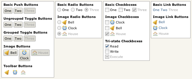
Some Pivot buttons.
Pivot also provides a number of additional button classes that expand on the functionality offered by the basic button types:
-
ListButton - Also known as "drop-downs", list buttons are similar to an HTML <select> element. They are discussed in the Lists section of the tutorial.
-
MenuButton - Menu buttons are similar to list buttons but provide drop-down access to a popup menu rather than a list; they are discussed in the Menus section.
-
CalendarButton - Provide drop-down access to a calendar component; discussed in the Calendars section.
-
ColorChooserButton - Provide drop-down access to a color chooser component; discussed in the Color Choosers section.
Menu.Item and MenuBar.Item are two additional Button subclasses. They are used primarily by the menu components and are discussed in the Menus section.
Next: Push Buttons